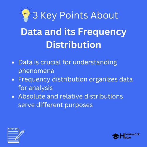
📝 Summary
In our daily lives, we constantly encounter data, which includes qualitative and quantitative types. Frequency distribution is a key method for organizing and summarizing this information, making it easier to identify patterns and trends. There are two main types of frequency distributions: absolute and relative. Constructing a frequency distribution table involves collecting data, organizing it into categories, and counting occurrences. Visual tools like histograms and pie charts enhance comprehension. This understanding is essential in various fields, such as business, education, and healthcare.
Understanding Data and Its Frequency Distribution
In our daily lives, we constantly encounter data. Whether it’s the score of a game, the temperature of a city, or the results of a survey, data plays a vital role in helping us make sense of the world. Understanding how to organize and analyze this information is crucial, and one of the most effective methods to do this is through frequency distribution.
What is Data?
Data refers to a collection of facts, figures, and statistics that can be analyzed to help us understand a particular phenomenon. It can be qualitative or quantitative in nature:
- Qualitative data: This type of data describes qualities or characteristics. For example, colors, names, or labels.
- Quantitative data: This involves numerical values that can be measured or counted. Examples include height, weight, and temperature.
Both qualitative and quantitative data are essential in various fields like science, business, and social studies.
Definition
Qualitative data – Data that describes non-numeric qualities or characteristics. Quantitative data – Data that involves numbers or measurable variables.
Examples
Consider a school where students are categorized by their favorite subjects. The favorite subject of each student (math, science, arts, etc.) is qualitative data. On the other hand, the age of each student is an example of quantitative data.
What is Frequency Distribution?
Frequency distribution is a method used to organize and summarize the data by showing how often each value (or range of values) occurs. It transforms raw data into a format that presents a clear overview of the distribution of values.
For example, imagine you have the ages of 30 students in a classroom. A frequency distribution will show how many students fall into certain age groups, such as:
- 10-12 years
- 13-15 years
- 16-18 years
This helps in identifying patterns and trends in the data that might not be immediately apparent when looking at the raw figures.
Types of Frequency Distribution
There are two main types of frequency distributions: absolute frequency distribution and relative frequency distribution.
- Absolute frequency distribution: This shows the actual count of occurrences for each value or category. For example, if 5 students are aged 12 and 6 are aged 13, the absolute frequencies would be 5 and 6 respective to those ages.
- Relative frequency distribution: This shows the proportion or percentage of the total observations that fall into each category. For instance, if there are 30 students in total and 5 are aged 12, the relative frequency would be (frac{5}{30} = 0.17) or 17%.
❓Did You Know?
Did you know? The first known use of frequency distribution dates back to the early 19th century, initially used in the fields of medicine and psychology!
Constructing a Frequency Distribution Table
To create a frequency distribution table, follow these simple steps:
- Step 1: Collect the data. Gather all your observations succinctly.
- Step 2: Organize the data into intervals or categories based on your needs.
- Step 3: Count the occurrences of each value within its respective category.
- Step 4: Create the table, clearly listing each value along with its corresponding frequency.
Here’s a simple example of how to construct a frequency distribution table for the ages of fifteen students:
- Ages: 10, 11, 12, 12, 13, 14, 14, 14, 15, 16, 16, 17, 17, 17, 18.
The frequency table would look like this:
- Ages | Frequency
- 10 | 1
- 11 | 1
- 12 | 2
- 13 | 1
- 14 | 3
- 15 | 1
- 16 | 2
- 17 | 3
- 18 | 1
Visualizing Frequency Distribution
Visual representation of data is much more impactful than tables. Graphical tools help to illustrate frequency distributions effectively. Some common graphical representations include:
- Histograms: These display the frequency of data within specified ranges using vertical bars.
- Pie charts: Useful for showing percentage distributions visually.
- Bar graphs: These can show the absolute frequency for each category clearly.

Applications of Frequency Distribution
Frequency distributions are widely used across various fields:
- Business: Companies can analyze customer preferences and behaviors.
- Education: Schools use it to understand students’ performance trends.
- Healthcare: Analyzing patient data helps in understanding disease patterns.
- Social Sciences: Researchers analyze populations and survey data.
Conclusion
Understanding data and its frequency distribution is essential for making informed decisions based on quantitative analysis. By collecting, organizing, and interpreting data effectively, we can discern patterns and gain insights that lead to better outcomes in various fields. Whether in your school project, a business plan, or scientific research, mastering frequency distribution will significantly enhance your analytical skills. Always remember, the way we handle data dictates how well we can understand the world around us!
Related Questions on Data and its Frequency Distribution
What types of data exist?
Answer: There is qualitative and quantitative data.
Why use frequency distribution?
Answer: It helps summarize how often values occur.
What are absolute and relative frequency distributions?
Answer: Absolute shows counts, relative shows proportions.
How can frequency distributions be visualized?
Answer: Using histograms, pie charts, and bar graphs.
